Our team member from the Game Design minor finished constructing the overall layout of our level earlier this week. It consisted of large horizontal wall sections, placed in such a way as to create different paths for the player to travel. He then handed it over to me so that I could build the actual level using all of our art assets. It quickly became apparent during the process of placing assets and decorating the level that it’s very beneficial to have a large amount of assets to work with. Otherwise, the level feels all the more stale and unfinished. This caused me to pump out some more assets, at which point I became very tired and somewhat disappointed of our art style.
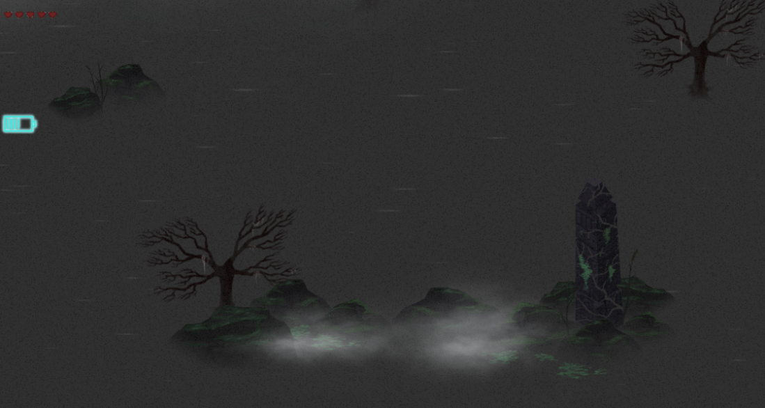
You see, when I designed the art style I focused heavily on two things: First of all, it should be easy to replicate for our other artist. For instance, instead of using textures it uses a grain overlay on each asset. Under it there’s just a solid color. We fade out the bottom part of the object with a feathered eraser if it is in contact with water to make it appear as if it is standing in mist. Fairly easy to use once you get into the workflow. However, since we ended up using separate art styles anyways, this was all for nothing.
The second thing was that the art style should make it easy to create objects that really stands out among its surroundings. This was done by mostly using desaturated colors from a fairly narrow range of lightness, which effectively lowers contrast. Then, we could just use a very bright and saturated color whenever we needed something to pop. This can for instance be seen in the red fires and was going to be used on particularly interesting, one of a kind structures and objects that the player could find scattered around the map. This was supposed to be the players payoff for exploring the nooks and crannies of the level. The problem was though that I haven’t had the time to do these interesting, one of a kind structures, so that also didn’t end up working out so well.

Basically, the art style had a lot invested in these two things, which was its main focus, and neither of them payed off.
5SD064

Hi Patrik!
The art looks totally amazing! I`m in awe!
My tip for you this week is to not judge your art or your assets too much, maybe it´s hard to see after staring at the art “blankly” for several hours a day, but the problems that you mention is barely seen.
Of course the different artstyles colliding can be seen a problem, and I think I speak for us all when I say that it´s a problem for most of us. Some persons can duplicate their styles and blend them into perfection, but for us in the first years this is something unusual, yet I dare to say not uncommon.
I can read that you tried with using the same teqnicues to achieve the “right look”, yet it was, as you said, not payed off. This can be frustrating, spending hours upon hours and then realizing that it still wasn`t correct. I would suggest you and your other artist to try and sit and draw together. It doesn`t have to be on the game, but if you want to be time efficient that would work too. Make sure you sit side by side so you both can see eachothers screens while drawing. Decide on a few pencils to use, and use only them. Decide on a few sizes, and use only theme. Try not having the same tools at all but trying to achieve the same quality of an asset (a good way of doing that would maybe be to choose something outside the game and learn from eachother how to draw in their way..) ex: draw a ball in comic style. Then ask yourselves, what tools did I use to achieve the comic look? If you have different ways of achieving the same thing, that might be how you should work.
In your text I can sense your irritation and frustration, it feels like you weren`t happy about this sprint, and writing this blogpost wasn`t your favourite thing to do. But the text also clearly convey how you feel about the situation. Overall the text is well written and once again the art is amazing!
Keep up the good work! 🙂
/ Hanna Aho Lind
LikeLike
Helllo Patrik!
First of all, I must say that the artwork can be anything but disappointing for the rest of us! Fits the setting very well, it’s rich and balanced regarding textures and the contrast between elements really catches the eye, so it doesn’t feel even slightly boring. I think we all understand how tiresome art-making can become when doing the same style over and over again, and the fact that we don’t have much free time left to do different things and take a break doesn’t help. But we can only keep on going and try to do our best! Even if it’s just for personal pride.
Defining and focusing the art-style, even though you considered it didn’t pay off this time, will be crucial for the future in a work environment, so don’t give up on it. In my opinion, focusing in those two aspects was a very good choice. Of course, group dynamics can’t always be anticipated or solved (yes, no one wants to hear that, but it needs some will from both sides and that’s not always the case), although I encourage all artists to try and work in the same physical space, try to talk about the issues. As Hannah said, it’s unfortunately not an uncommon problem for first years. Learning how to lead and how to follow instructions and yet contribute it’s still in process.
Would you say that the organisation and defining the art-style didn’t pay off at all? Not even for your own workflow and process?
The text seems well structured and easy to read. It is very well illustrated with images that show most of the points you make. Although I’m sure something good (apart from the art) must have come out of the decisions made!
Good job!
Sam
PD: I never got to playtest the game, and I know a couple of people who wanted to. Is there any way to playtest it? Feedback assured, of course 🙂
LikeLike